In this chapter we will provide an example of multiclass classification, using the “Palmer Penguins” dataset.
TipData Source
“Size measurements, clutch observations, and blood isotope ratios for 344 adult foraging Adélie, Chinstrap, and Gentoo penguins observed on islands in the Palmer Archipelago near Palmer Station, Antarctica. Data were collected and made available by Dr. Kristen Gorman and the Palmer Station, Antarctica Long Term Ecological Research (LTER) Program.”
Our goal will be to predict the species of a penguin, given features such as their weight, size, and gender.
What other variables are you interested in exploring?
17.2.1 Relationships
Let’s examine the weight of a penguin, by island, to see if we can notice any patterns in the data:
import plotly.express as pxpx.scatter(df, x="body_mass_g", y="island", color="species", title="Body Mass by Penguin Species", height=300)
It looks like island and weight might be suitable features, as they help differentiate between the various species. Specifically we can make the following observations:
Only one species of penguin lives on “Torgersen” island.
Two species of penguin live on “Biscoe” island, but these species are separable by their weight.
Two species of penguin live on “Dream” island, but the data aren’t separable by weight, so we might need additional features.
We are starting to develop an intuition that penguins on the “Dream” island might be the hardest to classify.
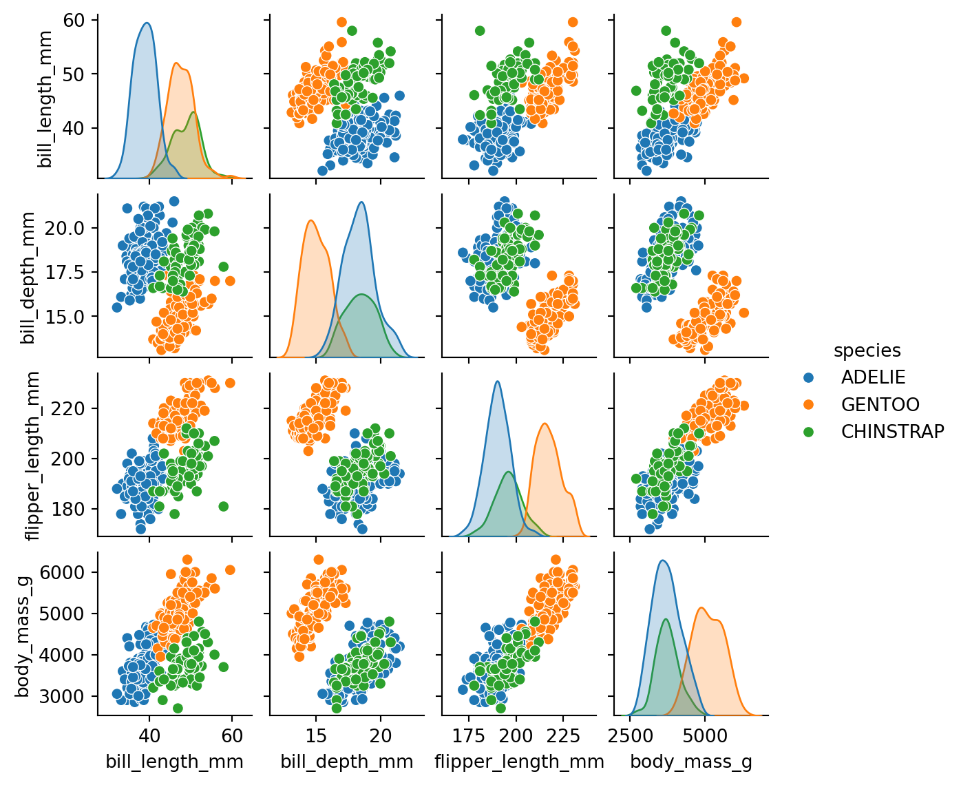
17.2.2 Pair Plots
Examining the relationships between each pair of variables:
from seaborn import pairplotpairplot(df, hue="species", height=1.5) # height in inches
What relationships do you notice between specific pairs of variables? Which features could potentially help us separate or differentiate members of the different classes?
17.2.3 Correlation
Examining the correlation between each pair of variables, as a more formal measure of their relationships:
Code
from pandas import DataFrameimport plotly.express as pxdef plot_correlation_matrix(df: DataFrame, method="pearson", height=450, showscale=True):"""Params: method (str): "spearman" or "pearson". """ cor_mat = df.corr(method=method, numeric_only=True) title=f"{method.title()} Correlation" fig = px.imshow(cor_mat, height=height, # title=title, text_auto=".2f", # round to two decimal places color_continuous_scale="Blues", color_continuous_midpoint=0, labels={"x": "Variable", "y": "Variable"}, )# center title (h/t: https://stackoverflow.com/questions/64571789/) fig.update_layout(title={'text': title, 'x':0.485, 'xanchor': 'center'}) fig.update_coloraxes(showscale=showscale) fig.show()
Since some features are categorical, we must encode them. Here we are using a one-hot-encoding approach:
from pandas import get_dummies as one_hot_encode# since encoding transforms and removes the original columns,# only try to encode if we haven't already done so:if"island"in x.columns: x = one_hot_encode(x, columns=["island", "gender"], dtype=int)print("X:", x.shape)x.head()
X: (333, 9)
bill_length_mm
bill_depth_mm
flipper_length_mm
body_mass_g
island_BISCOE
island_DREAM
island_TORGERSEN
gender_FEMALE
gender_MALE
0
39.1
18.7
181.0
3750.0
0
0
1
0
1
1
39.5
17.4
186.0
3800.0
0
0
1
1
0
2
40.3
18.0
195.0
3250.0
0
0
1
1
0
4
36.7
19.3
193.0
3450.0
0
0
1
1
0
5
39.3
20.6
190.0
3650.0
0
0
1
0
1
Now that we have encoded the categorical features we can examine their correlation as well:
What lessons are we learning about the correlation of these additional variables?
17.5 Feature Scaling
Since we have multiple features, it may be helpful to scale them, to express their values using similar scales, and prevent some features from artificially overpowering the model. Here we are using a standard scaling approach:
In a Jupyter environment, please rerun this cell to show the HTML representation or trust the notebook. On GitHub, the HTML representation is unable to render, please try loading this page with nbviewer.org.
LogisticRegression(random_state=99)
Getting artifacts of the training process, specifically focusing on the coefficients:
model.coef_.shape
(3, 9)
Unlike binary classification in which there are a single set of coefficients, in multiclass classification there are a different set of coefficients for each of the classes present in our target variable. In other words, each feature may contribute differently to predicting members of the different species.
Wrapping the coefficients in a DataFrame, using corresponding column and index labels, allows us sort and compare them:
Under the hood, the model assigns a different probability for each class. For its final prediction, the model chooses the class that has the highest likelihood (i.e. the “argmax”) for each row: